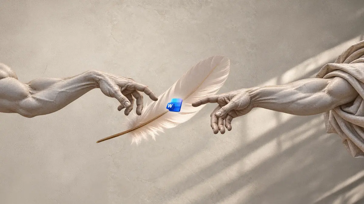

A new typeface based on Michelangelo’s handwriting is being added to the font library in Microsoft 365 apps such as Word. Called Michelangelus, it was commissioned by the Fabbrica di San Pietro, the institution that looks after St. Peter’s Basilica in Rome, and Microsoft shared the story on October 8.
The font marks the 400th anniversary of the basilica’s consecration, which will be celebrated with a ceremony on Nov. 18. The Fabbrica plans to use it on its own digital and printed materials and on signs inside the basilica. It also chose to share it with everyone, so it will be available to download for people who want to use it outside Microsoft 365.
From archive letters to a working typeface
Michelangelo designed the basilica’s dome, sculpted the Pietà that sits inside it and painted the Sistine Chapel ceiling nearby. The Italian design agency studiogusto did the research and the technical work of turning his writing into a digital font.
The team visited the Vatican archives to study his original manuscripts. Their goal was not to copy his handwriting stroke for stroke, but to find the consistent rules inside it and build a clear, modern tool around them. Some personal touches stayed, such as a small dot at the top of the lowercase h and at the bottom of the y.
“His impatience, his precision, his energy are in his calligraphy,” said Stefano Caliandro, studiogusto’s creative director.
How the letters were built
The designers started with lowercase italic letters, which follow Michelangelo’s hand most closely. The regular style and the capitals draw mainly on the inscription he carved on the Pietà, along with other inscriptions inside St. Peter’s. That carved lettering is slightly tall and narrow, close to what designers call a condensed typeface.
For the capitals, the team began with M, because it appears so often in the texts and is the widest letter. There were no examples of numbers in Michelangelo’s hand, so the numerals were derived from his letters. The number one, for example, is based on the letter I.
The finished family comes in four styles: regular, italic, bold and bold italic. Each style has more than 500 characters.
What it means for you
If you use Word or other Microsoft 365 apps, Michelangelus should appear in the font list once it reaches the library, with no separate purchase mentioned. It suits invitations, posters, titles and other places where you want a classic, hand drawn look that stays readable. For long passages of text, a plain font is still the safer choice.
The announcement did not give an exact date for when the font will appear in Microsoft 365 or where the standalone download will be hosted, so watch the font list in your apps over the coming weeks.